Ever sat in a meeting with slides and slides of presentation that showed nothing but densely packed text and confusing charts? Most people have. It’s no wonder many don’t look forward to going into meetings when their first expectation is a poor presentation.
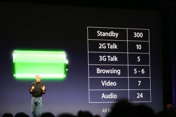
However, there was one man who could present and held the audience captivated. He was Steve Jobs. During his keynote speeches, he managed to get the audience hanging on to his every word and anticipating that “one more thing” that would leave everyone in awe. It helped that he had great products to present, but in addition, he used visuals as one of the most important tool of his presentation. He used minimal words (and numbers) written using a giant font. He used graphical icons to represent the current topic. He used animation for impact. Very concise and to the point.
-

- Simple

-

- Multi-color Use

-
- Effective Icon
-

- Animation

So why doesn’t everyone follow Steve’s presentation methods? Perhaps it’s because of the old thinking: “More is good”. The more stuff written down, the more credible and complete it gets. Unfortunately, these days, people are busy and have a short attention span. They don’t want to be held up in a long winded presentation.
The best ways to present effective visuals:
- Be simple
- Use graphics, icons, and symbols to reinforce or communicate a concept
- Use key words, not full sentences
- Contain only one concept per slide or page
- Contain only three to six ideas on each flip chart sheet
- Use color where possible, but not excessively
Steve Jobs was known to obsess over design. He was also obsessed with simplicity. It showed in his quality presentations. One can learn a great deal from his obsessions. It would make sitting in presentations a much more pleasant experience.